
Thumbprint
Involvement
Product Designer
Team
3 Product Designers, 1 Front End Engineer
Date
2015 - 1 month (but continuously updating)
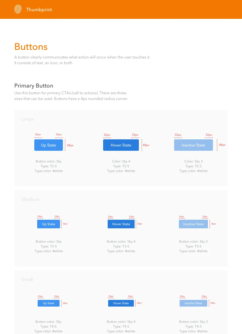
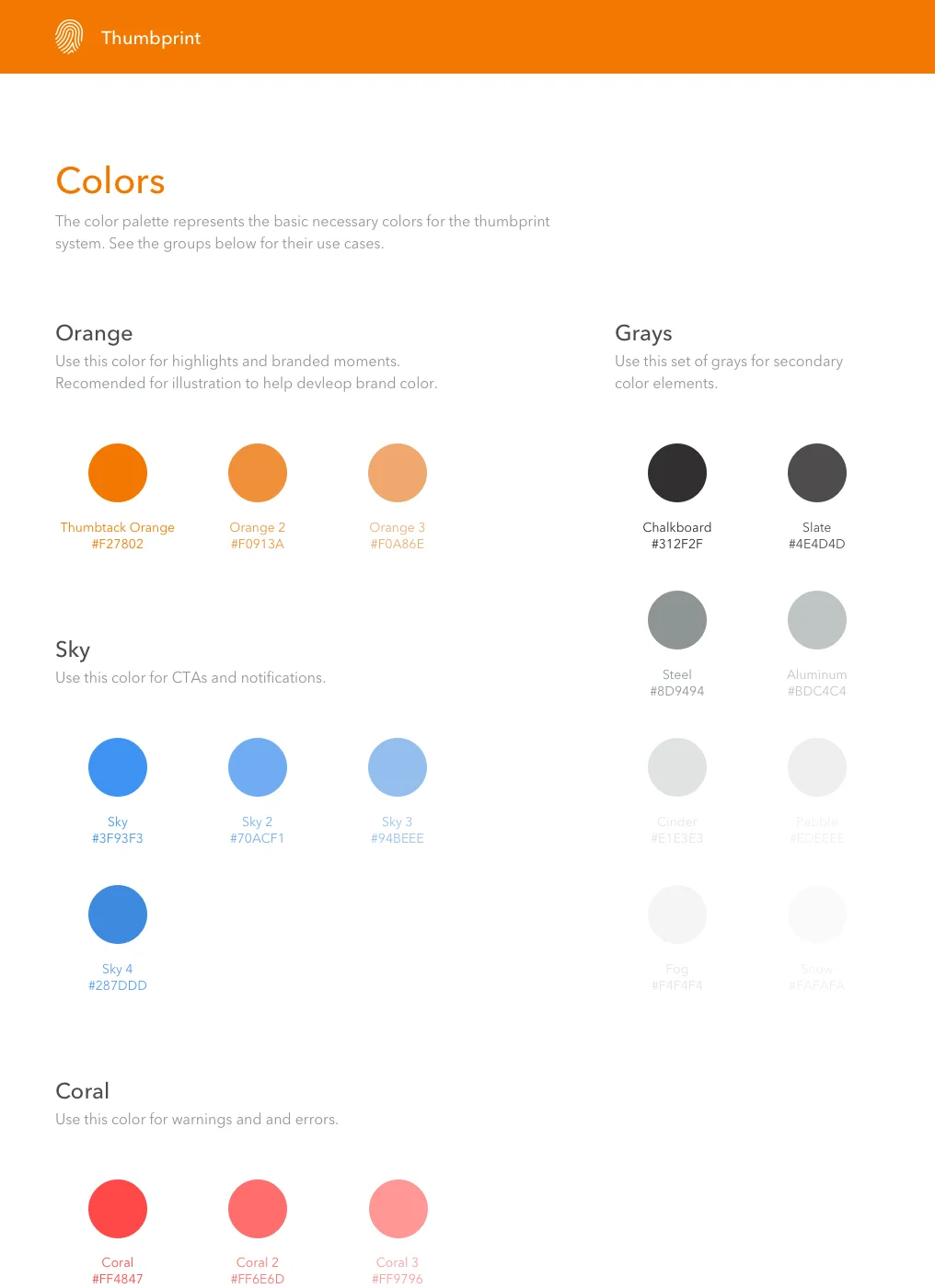
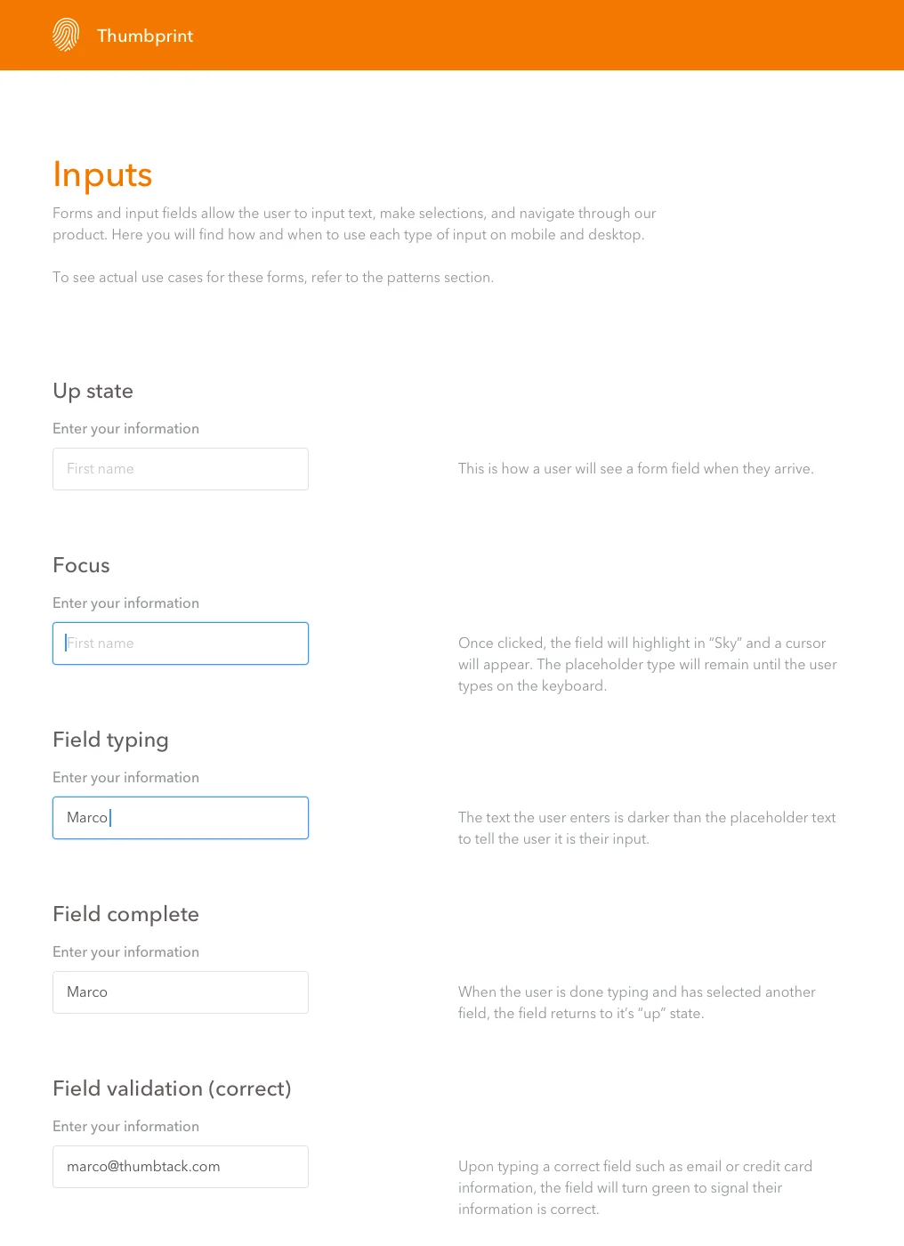
Thumbprint is the living styleguide system of basic UI elements built on a responsive grid. When assembled together, these elements create reusable patterns that help bring consistency across our products and efficiency in design and development.
The styleguide is living because as our team & product grows so do our elements and patterns.
Elements
Check out some of the main elements that helped define the base UI language for Thumbtack.

patterns
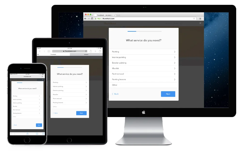
We started by building around 10-15 key patterns that we repeatedly use throughout the product to help give designers (and developers) an easy to way quickly build pages. As the team & product grows this section does too. It's best to design patterns that show up in 3+ areas, otherwise you run the risk of getting too detailed.


consistency
We’ve made our grid flexible to work on any device. We have four breakpoints for web, then Android & iOS. The styleguide makes it easier to design across 6 different screen sizes.
hand off
As a team we decided to move away from hand spec'ing our files and adopted to tools like Zeplin & InVision Inspect to help speed up our hand off process. By using Zeplin's styleguide sync feature, developers are able to get CSS for spacing, color names, type annotations & more.
Living styleguide
Having a well documented and thorough styleguide is a great first step. But as the product evolves, visual styles will change. New patterns will emerge as well. So the team has dedicated to coding the styleguide, allowing for these changes. We're also looking into tools like Craft, that will allow sketch elements to adapt and grow.